What is brand identity?
As the terms 'Logo' & 'Brand' are often used somewhat synonymously by many, let's take a look at what a Brand Identity System actually is.
Just like each one of us has our own personal identity that defines who we are and what we stand for, your brand identity is a special blend of characteristics and styles that sets you apart from all the other brands out there.
Brand Identity: the definition
Brand identity is the collection of all elements that a company creates to portray the right image to its consumer.
In a nutshell, it is the visual representation of a brand.
These elements come together to paint how your brand looks on magazines, websites, business cards, flyers, posters, brochures, banner ads, social posts, packaging and more.
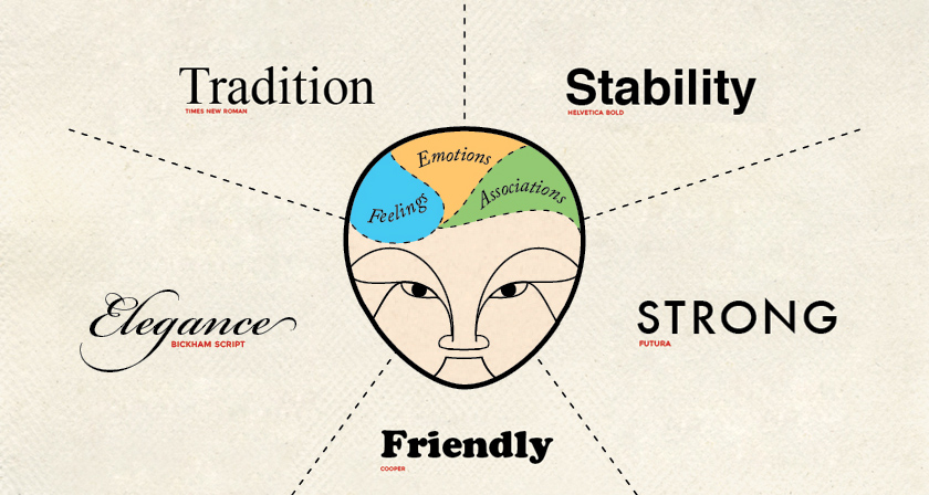
Brand Identity Personified
Successful brands of today tend to have common human characteristics, which start internally, with a Purpose, Vision, Mission, and Values. These internal human characteristics translate seamlessly from person to brand.
So how does this translate to the brand identity? If the brand is a person, the identity would be their appearance that portrays how others perceive them.
The first thing we tend to look at when meeting a person is their face. For a brand, this would be their logo. After you have taken note of the face, the rest comes into focus- their hair, clothes, style, etc. Likewise, a brand's identity after the logo is made up of typography, colour palette, icons and shapes.
Although the face is the first thing you see, the visuals don't end there. By observing the person as a whole, you naturally get a feel for their broader visual identity.
The same can be said for your brand. If all you have is a logo, you are likely restricting yourself by not expressing your brand in a way that helps your audience to relate to you on a deeper level.
How to develop a strong brand identity
Know who you are
Before you jump in and decide what visual elements you want to use to make up your brand identity, you need to know who you are as a brand.
If your brand was a person, who would they be? What would they stand for? How would they look or sound?
Who you are as a brand is made up of a few key elements:
- Your Purpose (why does your brand exist?)
- Your Vision (where do you want your brand to go?)
- Your Mission (how will you get there?)
- Your Values (what beliefs drive your company?)
- Your positioning (what sets you apart in your industry?)
- Your brand personality (what is your brand archetype?)
- Your brand voice (what language and tone do you use to communicate?)

Once you have a clear answer to each of these questions you have the elements that define your brand.
If you are having trouble figuring out exactly who your brand is, don't stress. Dot can provide you with a comprehensive brand-building guide to cover these topics with you.
With your key elements in mind, let's build your identity.
Developing your brand design
Before you start creating your design assets, you need to start from the ground up and lock in the basics of your design structure: the building blocks of your brand identity.
Typography
This refers to the font you choose for your branding materials.
The importance of typography in the design of a brand identity system cannot be understated.
Fonts are a powerful part of designing a brand. They convey energy, emotion, and personality. While there are thousands of different fonts to choose from online, it’s easiest to understand the five main types of fonts and go from there.
You'll want to consider what your font says about you before you make your final decision. Remember:
- Serif fonts offer a timeless and traditional look to a brand.
- Sans serif fonts show off a brand’s modern edge.
- Slab serif fonts feel more confident, solid and natural.
- Script fonts bring a sense of elegance to a brand.
- Decorative fonts are full of personality and convey a custom-designed look.
Colour Palette
All people (including your audience) have psychological ties to different colours. Using branding colours strategically can have a big impact on how your brand is perceived.
The colour palette is a set of specific colours (with specific colour values) that ensure the colour representation of the brand remains consistent. The colour palette is usually made up of a primary (first choice colour) secondary & complimentary (second choice colour) and supporting neutral colours.
Let's take a look at the different colours and what they can do for you to help you get your message across:
Forms/Shapes
When it comes to your designs, you also want to think about form and shape. This subtle but effective element that can be used to reinforce the desired reaction from your customers: so, for example, a logo that is all circles and soft edges will inspire a very different reaction from a logo that’s sharp and square.
Designing your brand identity
Now that you have the foundation of your design, it's time to work with a designer to bring your brand identity to life.
Logo
Your logo is the cornerstone of your brand identity.
You want to make sure that your design partner delivers your logo in multiple formats (like a black and white version, or a primary and secondary version) to ensure you always have the logo you need—and that each is in line with your brand identity.
You could also request that your designer provide you with a lockup variation, which are variations in the positioning of your logo. This is to allow flexibility in their environments. Stacked (iconic element above the type) vs Horizontal (iconic element beside the type), for instance.
Image Style
In today’s visual digital environment it is becoming more important to have a distinctive image style to illustrate and represent your brand visually. Image style can vary in colour, tone, filters, content, photography style and graphic application. The representation of images throughout a brand identity system is growing and so its importance is increasing.
Brand Collateral
Brand collateral is where the brand identity gets to speak visually. All of the elements of the brand identity; logo, image style, colour palette, graphic library, and typography, all come together to express the cohesiveness of the brand identity. Whether it is a business card, a brochure, an advertisement or a website, the brand collateral is the brand identity’s stage to perform.
Website
Your website is one of the most representative aspects of your brand identity. Especially if you’re running an online business or a digital product, your customers will definitely check your website out before deciding to do business with you. Your website is where your brand identity should come through in full force.
Business Card
If you’re doing any sort of business development (and who isn’t), you’ll want to stock up on business cards. A well-designed card offers the chance to reinforce a positive opinion of yourself in the eyes of potential clients or customers. When it comes to business card design, keep it simple: your company logo on one side of the card and your key personal details on the other side should suffice.
Brand Guideline
Every Brand Identity System must have a set of governing brand guidelines to protect the application of the brand and ensure consistency over time.
This document - which outlines your design assets, when and how to use them, as well as any design 'do’s' and 'dont’s' for your brand -will ensure that any future design is in line with your brand identity and generates the right perception with your audience.
Consistency is key to creating a strong brand identity. You wouldn’t want your brand to look totally different on social media than it does on your website. That would confuse customers and make your brand feel less trustworthy and professional.

Conclusion
The brand identity system is a true visual expression of the brand and goes much further than just a logo. Your brand identity is what sets you apart from the endless sea of competitors and shows your customers who you are and what they can expect from working with you.
It should give your audience some insight as to what’s on the inside as well as a reason to want to know more about you.
And if you want your brand to be perceived in a positive light, it’s crucial that you nail your brand identity and create designs that accurately portray who you are to your customers.