THE BRIEF
Overview
Beyond the Burrow Early Learning and Care is a vibrant early learning centre dedicated to providing nurturing and enriching environments for children.
They approached Dot Design Studio to create a cohesive brand identity that reflects their values and connects with their community.


THE SOLUTION
Logo Design
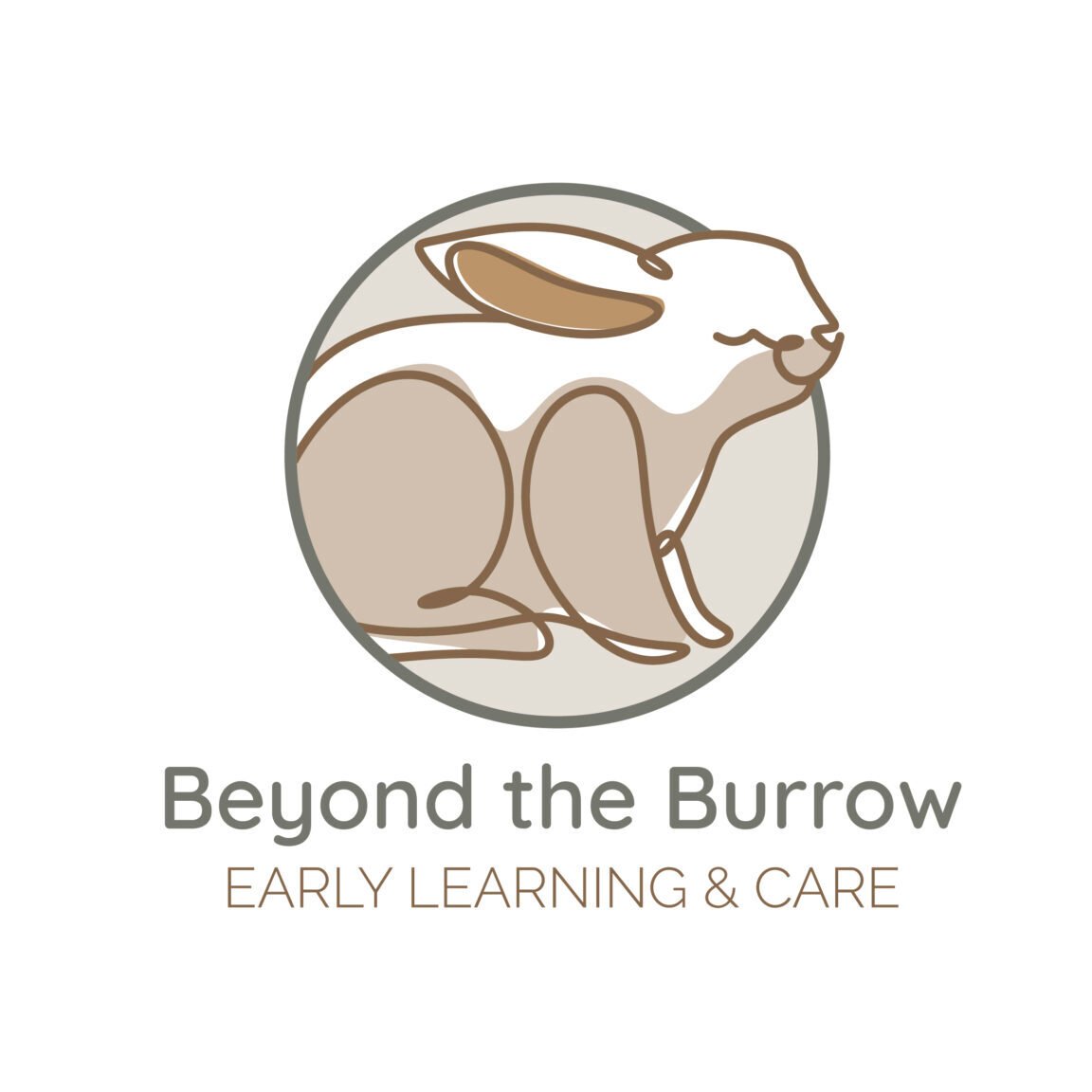
The logo was designed to be warm, welcoming, and playful, capturing the essence of childhood curiosity and exploration.
We used soft, earthy colours to convey a sense of comfort and trust, while incorporating elements that reflect the natural world, which aligns with their focus on fostering a connection to nature in their learning approach.
Website Design
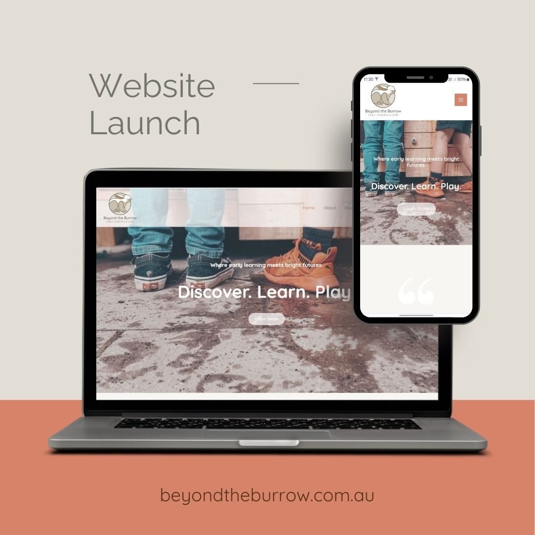
We built a clean, user-friendly website that serves as both an informational hub and a welcoming introduction to the centre's philosophy and programs. The design is responsive, ensuring a seamless experience across all devices, and integrates intuitive navigation with engaging visuals to highlight the unique aspects of Beyond the Burrow’s services.

Brand Guide & Stationery Design
To create a cohesive and professional brand presence, we developed a comprehensive brand guide outlining the use of the logo, colours, typography, and imagery, ensuring all materials are consistent with Beyond the Burrow's identity.
We designed a suite of digital and print stationery, including email signatures and letterheads. These elements feature the centre’s soft, earthy colours and natural motifs, reinforcing the brand’s friendly and nurturing ethos across all communications.
